Saturday, 12 February 2011

Evaluation: What have you learnt about technologies from the process of constructing this product?

During the process of this magazine production coursework I have learnt a lot about the process of magazine construction.

In the production of the preliminary task I mainly used paint and a photo editing software called picasa 3 to edit and crop the images (see school magazine deconstruction). I realised that this was a time consuming process and to make my music magazine coursework more professional and effective I would need to use a different software.

I started testing two softwares to see which one would best suit the needs of my photographic manipulation. They were http://www.picnik.com/ and Photoshop Elements 5.0 exe.

Below is an example of the editing using http://www.picnik.com/ :


After comparing the quality of the editing above with the quality of Photoshop Elements 5.0 exe, I decided photoshop was the best software to use. This is because when experimenting with the two facilities it became apparent that photoshop enabled more accurate and so professional cropping and more subtle but effective image editing. In the image shown above it is clear the image has been edited but doesn't look very effective in creating a professional finish.


Shown below is the comparison of quality of my images being cropped on paint and on Photoshop Element 5.0 exe:

Original photograph


          Paint Image


Photoshop Element 5.0 exe image


To take all my images for my music magazine coursework production I used a Fujifilm finepix s1600 camera, like the one shown below.


Evaluation: Looking back at your preliminary task, what do you feel you have learnt in the progression from it to the full product?


When comparing my preliminary task of creating a school magazine with my final music magazine production, I can see areas where my skills have progressed.

I think that my strengths in the production of the preliminary task are as follows. I created a clear house style, used models the same age as the audience and included iconic magazine features such as a barcode and issue number. I also manipulated my images to appear as a hopscotch, which is something the audience can recognise and associate themselves with and I used simple and mainly primary colours.

However, although I am pleased with this production, now that I have learnt more about magazine features and aspects, I do acknowledge that there are some weaknesses in this original production, the main weakness being the amount of unfilled space. On the front page especially, there are white areas where I could have included a caption about a featuring article instead of leaving it blank. By doing this it would look more professional and be more iconic of a magazine. Therefore, in the production of my music magazine coursework I ensured that I used as much space as possible unless left blank for a specific effect.

Friday, 21 January 2011

Production Completed: Final Music Magazine coursework piece

Below is the final music magazine coursework piece that I submitted.


Please see the Publisher document to read the magazine article shown below


Tuesday, 30 November 2010

Production Process: Contents page and double page spread development

I originally designed the draft contents page shown below.


After I created this draft, I realised that it didn't really follow the format of a magazine contents page. By researching into existing music magazines I acknowledged that images are featured more heavily on contents pages and so i created the following draft.


The new draft of my contents page is more iconic of that of a music magazine.

The red area towards the bottom of the page is for a magazine subscription deal. To calculate what price I should offer I worked out what the correct yearly price would be if the audience purchased it every week for a year:
£2.49 x 52 = £129.48
and so to entice the audience and make the subscription deal worthwhile I set the price at 60% of the annual cost which is £77.69 for a yearly subscription.

"Subscribe to Xtreme for a year for only £77.69"

I realised that for a reader looking at this number in the magazine it appears to be a high amount. Therefore, to make it more appealing I divided it into 12 monthly instalments 77.69/12 = £6.47 as this is an odd amount I rounded it up to £6.50.

"Subscribe to Xtreme for a year for only £6.50 a month"


Below is the contents page from Kerrang's September 2010 issue which I scanned into the computer. I used this as a guideline for how to produce a profesional and conventional magazine contents page.


My final contents page


When developing my double page spread, I wanted to include an exclusive interview with the female band featuring on the front of the magazine. I used the magazine technique of columns to display my interview text on one of the pages and then to make my band picture stand out and be striking to the audience, I decided to dedicate the whole of the second page to that image.

This could be a risky technique as it could leave the pages looking bare but it looks effective in the image I scanned in below from Kerrang magazine.


My final double page spread


Tuesday, 23 November 2010

Production Process: Image editing development

So far in the production of this music magazine coursework I have used 3 editing programmes to manipulate my images. They are: Picasa 3, Paint and http://www.picnik.com/. Although I used all of these software products efficiently and they did enable me to meet the needs of the requirement, in order to ensure a more professional presentation I decided it would be best to use Adobe Photoshop Elements 5.0 (Editor). The other programmes that I have used so far were ideal for changing the lighting and texture of the image but effective cropping was an issue. Therefore, I decided to experiment my cropping ability on Photoshop by cropping an image that would appear on my front cover.

This is the image that I first took of the guitars:


Then I roughly cropped out the background around the two guitars on paint.

After this I uploaded the image onto photoshop and did the following:


Thursday, 18 November 2010

Production Process: Advert and contents page progress

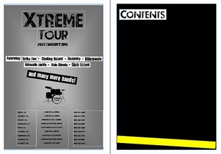
From looking at already existing music magazines, the contents page usually appears on the second page of a double page spread. Therefore on the first page, I decided to include a fictional advertisement to advertise an 'Xtreme Tour'. I created fictional bands to feature on this advertisement and top locations throughout the UK for the bands to play at. I carefully considered the dates that I included and the venues at which the tour will visit so that it would be within a time frame that is possible and realistic.

Below is an example of an advert and contents page double page spread taken from the September 2010 issue of Kerrang magazine, which I scanned on to the computer.


Draft of my attempt

After I constructed this advertisement I realised that because this advertisement area is of such a prime location within the magazine, that other companies would pay a great deal of money to advertise their product in this position. Therefore, if my magazine was real it would benefit more from having an advertisement in this position from another company or brand. For example, I could include a tour advertisement but for one band instead of my own magazine or I could include an advertisement for a separate product that is related to the rock genre.

Production Process: Draft of front cover

Shown below is an image of my front cover with all of the features so that I can look at which features need to be positioned in different areas on the page and which features work well in the position they are in. Also, I can get a feel for what sizes the various images should be and can then edit them to perfect the front cover.


I used http://www.dafont.com/ to find the appropriate font for my music magazine. When searching through this website I realised that they featured a vast array of fonts. So I narrowed my search by looking through the 'destroy' font section as I perceived this to be most suitable for my genre.

This is where I found the font '28 days later' and decided to use this as the font for my masthead.


I then went on the 'eroded' font section and found the font 'you are loved'. This is the font I used to represent my featured articles through the headlines and the stand first.
Below is an example of the font 'you are loved'.